After researching More Than Conqueror's artwork, and the artwork of similar artists we finally set out to design our digipack. The first cover we designed was the front cover. This was inspired by More Than Conqueror's artwork, the narrative and also the symbolic meaning of our music video and love.

The front cover of the digipack reflects elements of our narrative whilst containing aspects that are like more than conquerors drawings in When The Wells Run Dry. The daggers represent violence and the murder in the narrative and the weddings contain yet a romantic feeling to them.

The back cover is aimed to convey a creepy ominous feeling especially where the torchlight reveals the song list border by thin trees.


Both of the hands here are depicted to be cold and dead which tells the audience that these are the hands of the recently deceased that honoured the commitment of marriage.

The shattered glass is more metaphorical and represents the broken life of our husband character and how everything he knows is falling to pieces
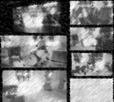
The collage of photos is actually picture that we took during filming of the band but the pictures themselves seemed too bright and happy so we grey scaled them and distorted them to look more somber.

No comments:
Post a Comment