- In what ways does your media product use, develop or challenge forms and conventions of real media products?
- Our media product being a music video for the song 'Hearth and Home' by More Than Conquerors limited us to certain methods and conventions. For example we knew early on that we would have to match the pace of the song when it was both slow and fast.
- Our particular song led us to portray a very sad and angry story and that is reflected in the genre of our band. Previous music videos provided us with examples of how violence and sadness were brought out through the music. We as a group decided to take this a step further with our character committing acts at the very tip of the scale i.e a murder and a suicide, both very grim ideas that are shown in the lyrics of the song.
- Another concept that we chose to further develop was the idea of true love being taken away, in this case we developed this idea by having the husband character kill his wife out of rage off screen but show the immediate regret at his mistake.
- What we challenged in our video though is whether the audience should like our character of the husband on the run. Some of our audience might dislike this character as he has killed his wife in an angry rage and fled from those trying to bring him to justice but on the other hand some of the audience might be on the same side of the character, judging the murder as a mistake because as the heaven/forest scene demonstrates he misses and loves his dead wife and shows remorse to the point where he kills himself to be with her again.
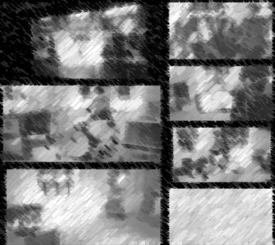
- How effective is the combination of your main product and ancillary texts?
The combination of the website and the digipack were modelled and thought up around the video itself so we used existing elements from more than conquerors and modified them to suit the both types of ancillary texts.
Intially we had problems coming up with ideas for each panel of it but our result reflects the dark settings and story of our video without spoiling any story elements but also the band shots in the collage depicts shots of the band when we filmed them in March intermingled with story element like in our video. Overall the digipack was effective in representing all elements of the video, the cover containing both elements of love and death and effectively portrays that to the viewer.
The website on the other hand being more geared toward publicising the band itself and contains less narrative elements and more performance focused photos, i felt that the website surrounded the video well and brought out the more informal side of the band whilst keeping the dark somber mood.
- What have you learned from your audience feedback?
From our audience feedback we have learned that the video seemed static with little camera movement despite the fast pace in some parts. I think this is particular problem in the various scenes with the torch pursuers and sometimes killed the pace at times.
The audience also commented on the bad acting of myself but this was essentially unavoidable we had no real options but the people in our media group.
What we also learned from our feedback was that the song in some parts was out of sync, but even during editing we saw this but couldn't do much to correct this as we had to work with what we had as we had no chance of reshooting or being send a new song.
- How did you use media technologies in the construction and research, planning and evaluation stages?
- Before we were issued a song to work with we compiled a lot of research onto music similar to More Than Conquerors but not contained to the same sub-genre. Last fm was vital in finding music that mirrored the band's as it showed similar artists and bands. From this we studied the work of several different bands noting the different stories they told, their concepts and the various shots and movements they used in their music videos. Some of the work that we viewed via YouTube used brilliant lighting ideas that we then applied to our own video for example the low creeping light of the night to convey a foreboding feeling.
- When we did get the song we began constructing the video around the music and by using Finalcut Pro X we were able to plan when we wanted to change shot right down to the exact millisecond. This kind of planning on the same software that we would use to construct our piece saved us time figuring out when to cut to the next shot. Finalcut also enabled us to make an animatic video of the song with storyboards showing us how the piece would flow against the song and also showed a framework of the shots in order, in context.
- During the construction of the piece the use of the more advanced sections of Finalcut helped add the polish to the video for example the use of optical flow helped make the wife's death more dramatic and the use of effects during the heaven scene makes it stand out as a flashback or afterlife scene depending on interpretation. What is probably unnoticeable during the shots of the band we edited in a beam of light like a torch to evoke that the character is being hunted everywhere and the band may harbor the murderer.
- Social media, in our case Facebook was essential in receiving constructive criticism through out all stages of the project from our audience. By creating a page for our piece we could put forward ideas and progress for the target audience to judge and add comments about our piece even before it is complete. It helped us reach out to our audience and gather their opinion so that we could evaluate our music video based on their comments.